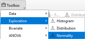
Normality
The Normality feature allows researchers to assess whether data follow a normal distribution, which is a key assumption for many statistical tests such as t-tests and ANOVA.
In TSE Analytics, Normality can be explored under the Exploration widget. Visualization tools, including Normality plot, help illustrate the data distribution and evaluate deviations from normality across groups, providing guidance for the selection of appropriate statistical methods.
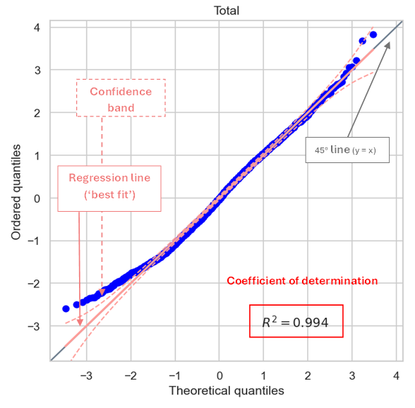
Normal probability plots are scatter plot in which, for each value of the dataset, the actual quantiles of the sample data (ordered quantiles) on the y-axis are plotted against the theoretical quantiles of the respective normal distribution on the x-axis (blue dot). An alignment of the plot with the 45° line (y=x) indicates a normal distribution of the sample data.
In addition, normality plots contain a ‘best-fit’ line resulting from linear regression analysis of all data points included in the plot, together with the confidence band and the coefficient of determination R2.
The appearance of the 45° line, regression line and confidence band of the normality plot can be customized by using the Curves tab implemented in the Figure options window accessed via the ‘Customize’ tool (‘Graph’ symbol) in the plot menu. Here, the style, width and color of lines can be adjusted, and markers can be added or customized.
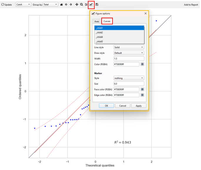
The lines to be customized can be selected from the dropdown menu at the top of the Curves tab: - _child1: 45° line - _child2: Regression line - _child4: Upper bound of the confidence band - _child5: Lower bound of the confidence band
Example Interpretation
The Normality function tests whether a dataset follows a normal distribution, a key assumption for many statistical analyses such as t-tests, ANOVA, and linear models.
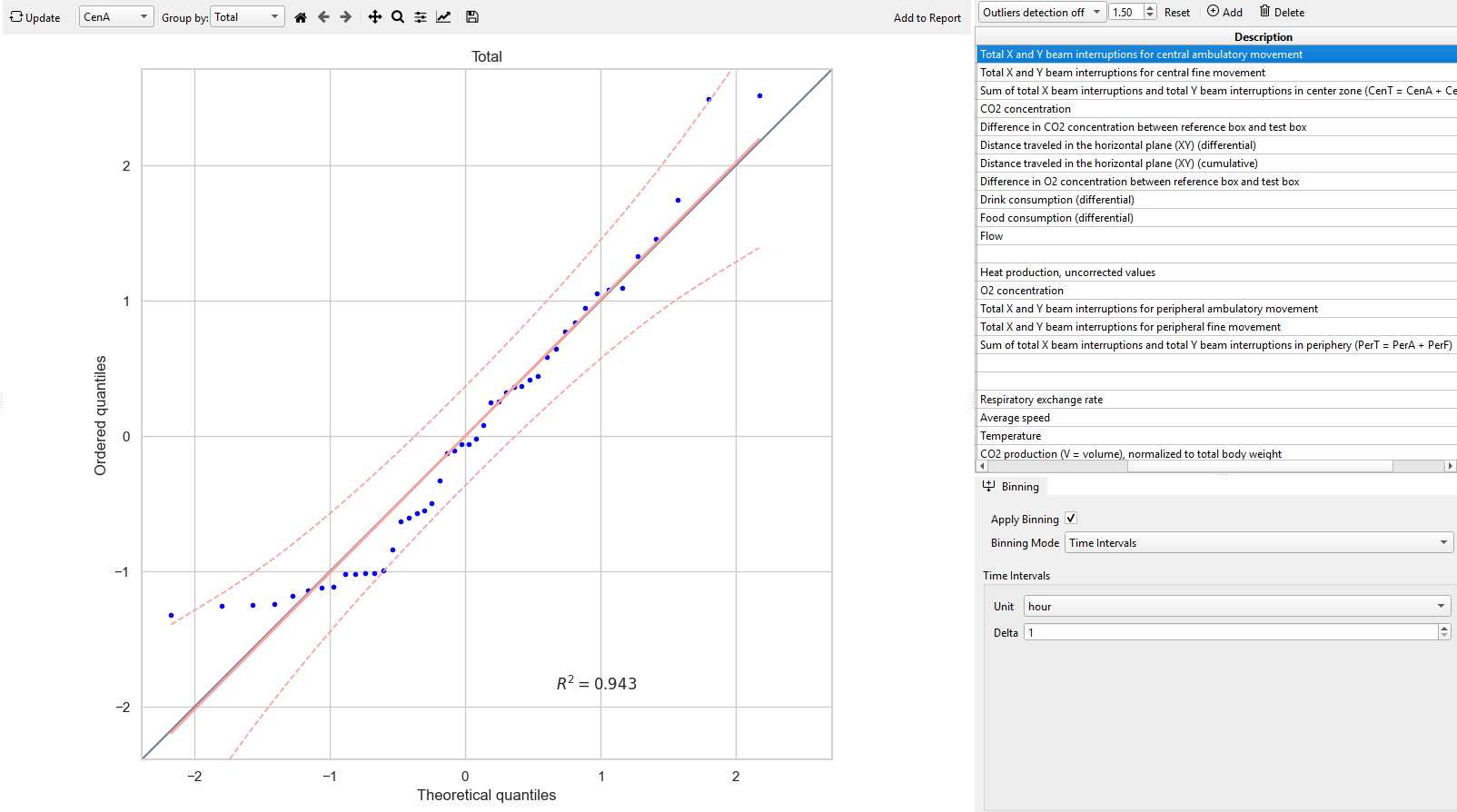
The figure below shows a Normal plot for the variable CenA (total X and Y beam interruptions for central ambulatory movement) recorded by the PhenoMaster system.
In this plot:
- The x-axis shows the theoretical quantiles expected from a perfectly normal distribution.
- The y-axis shows the actual ordered quantiles of the observed CenA values from the experiment.
- Each blue dot represents one data point in the dataset.
- The solid red line is the best-fit regression line through the data points.
- The gray diagonal (45°) line represents the ideal case of perfect normality (i.e., theoretical = observed).
- The red dashed lines show the 95% confidence band.
If the blue points closely follow the 45° line, the data can be considered approximately normally distributed.
In this example, the CenA data points align closely with the 45° line and fall mostly within the confidence band. The coefficient of determination (R² = 0.943) further indicates a strong linear relationship between theoretical and observed quantiles. Therefore, the CenA variable can be considered approximately normal.
As a result, parametric statistical tests, such as the paired t-test or ANOVA are appropriate for this dataset.