Histogram
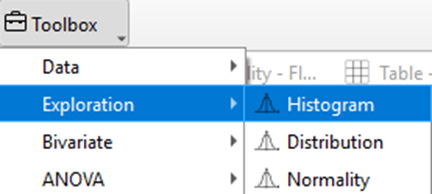
The histogram visualizes the distribution of a single variable, allowing researchers to see how frequently specific value ranges occur within the dataset. In TSE Analytics, the histogram can be generated by selecting Histogram under the Exploration widget.
- The x-axis of a histogram plot represents the range of data values included in the plot. The y-axis indicates the number of datapoints falling into a defined range of values, referred to as ‘bin’.
- Bins are represented by columns in the histogram plot. The column width shows the range of values covered by a bin, while the height of each bin indicates the number of datapoints assigned to a bin.
- The number of bins used in TSE Analytics is fixed and cannot be adjusted. The width of bins is calculated automatically, based on the total range of values displayed in the current plot divided by ten.
Example Interpretation
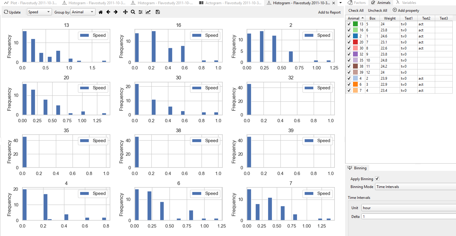
This histogram showing the distribution of animal speeds, with speed in (cm/s) on the X-axis and frequency of occurrence on the Y-axis.
On this representative example, we can observe that animals No. 32, 35, 38, and 39 show peaks near 0 cm/s, indicating that they remained mostly inactive during the observation period. In contrast, animals No. 6, 7, and 13 show a wider range of speed values, suggesting a higher level of locomotor activity.
Note
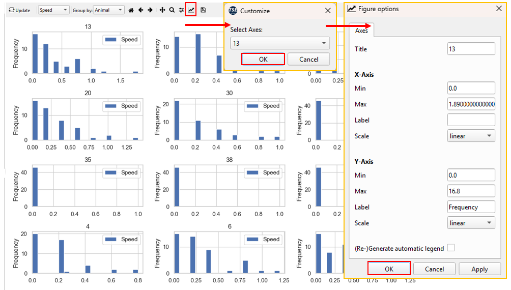
In TSE Analytics, histograms are plotted with X- and Y-axis ranges automatically adjusted based on the data's minimum and maximum values. As a result, different histograms may have different scales,for example, one speed range might be 0.0–1.6, while another is only 0.0–0.8. This ensures that each plot accurately reflects the distribution of its data. Users should interpret bar heights according to the axis values, rather than by visual comparison alone. If desired, users can also manually adjust the axis ranges.