Matrix Plot
A matrix plot is a type of data visualization that represents data in a matrix format, allowing you to visualize complex relationships and patterns between different variables. Matrix plots use a grid structure where each cell within the matrix represents the value or relationship between two variables.
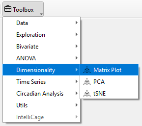
To perform a Matrix Plot in TSE Analytics, go to Add Widget | Dimensionality | Matrix Plot. First, select the dataset you want to analyze from the left side of the interface. Then, in the Variables list on the right, choose at least two variables to explore their pairwise relationships. Users can specify the analysis dimension in the Split Mode section.
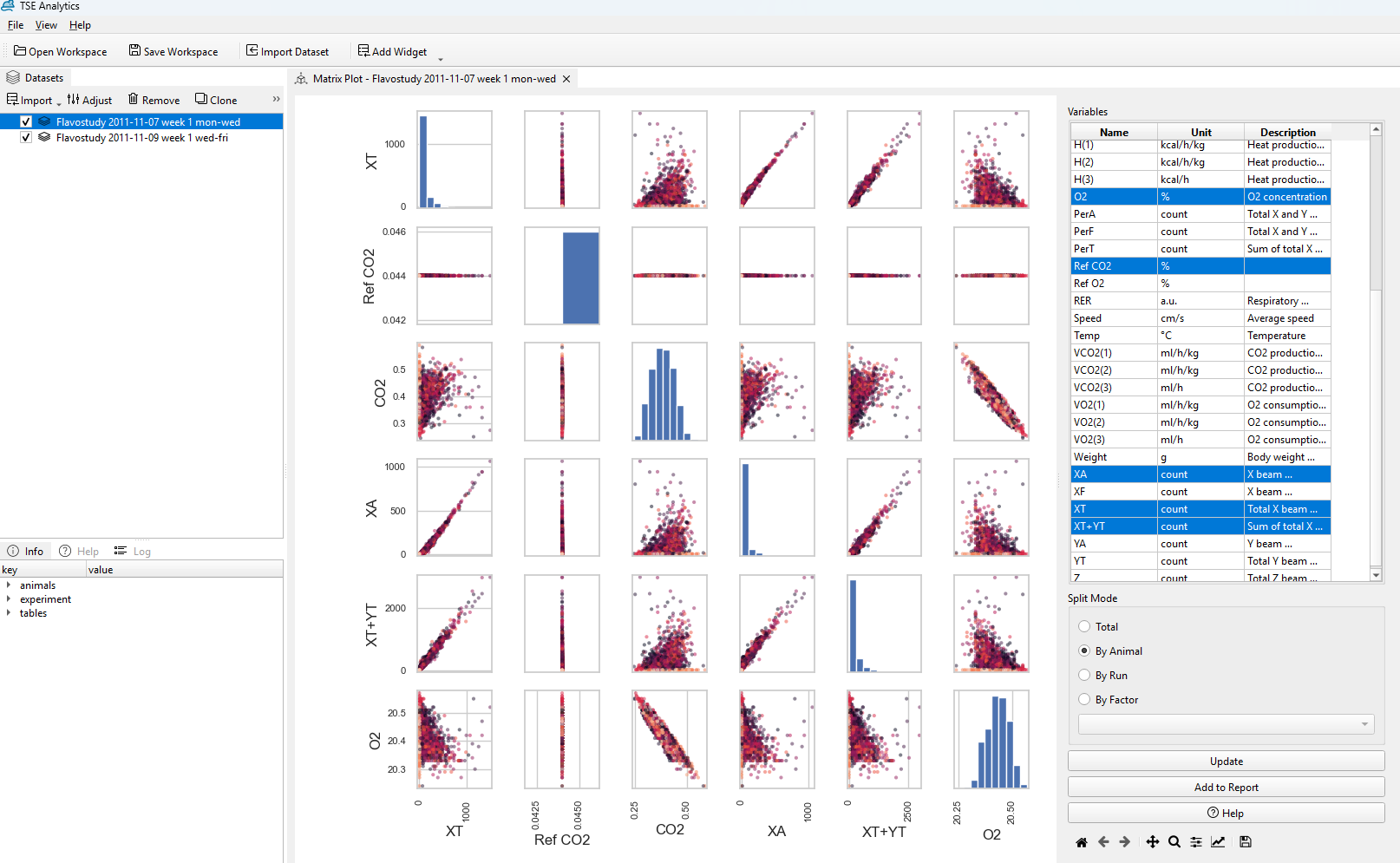
Once you've made your selections, click Update. The Matrix Plot will display the relationships between the variables you chose, making it easy to spot patterns or correlations that can guide your next steps in the analysis.
Note
The Matrix Plot works by identifying the pairwise relationships between selected features. Therefore, the software only works at least two or more variables for the Matrix Plot to generate meaningful results.