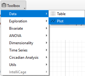
Plot
Line and scatter plots or bar plots can be generated using the Plot widget.
Using the control panel, researchers can choose the animals, experimental groups, variables, and time phases for plotting and analysis.
Warning
Only animals selected in the Animal list are considered for the calculation of plots in the Plot widget
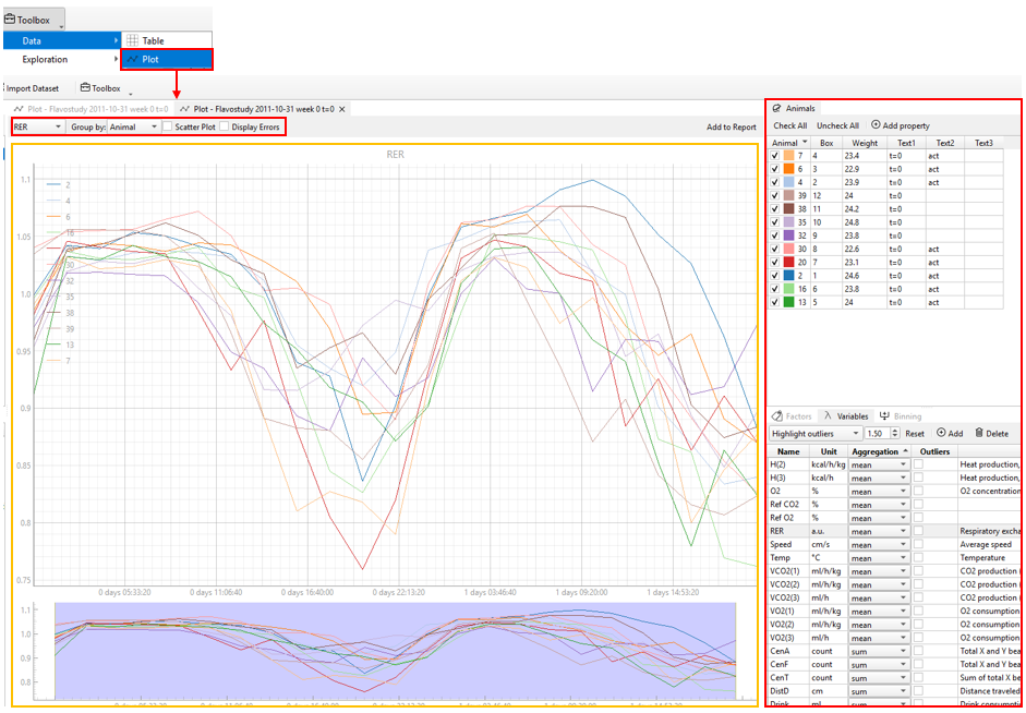
Various selections for plotting can be made using the control panel located above the plot.
-
Variable Selection: Users can select the variables of interest directly from the variables list using control panel above the plot. By default, descriptive statistics (aggregation) for the selected variables are calculated automatically. To view or modify these settings, use the Variables → Aggregation panel at the bottom-right of the interface.
-
Group Selection: By default, data are grouped by individual animals or totals. If factor groups have been defined in the Factors panel, the group list will also display any additional groups created. To add or remove groups, use the Factors → Edit Factors panel at the bottom-right of the interface.
-
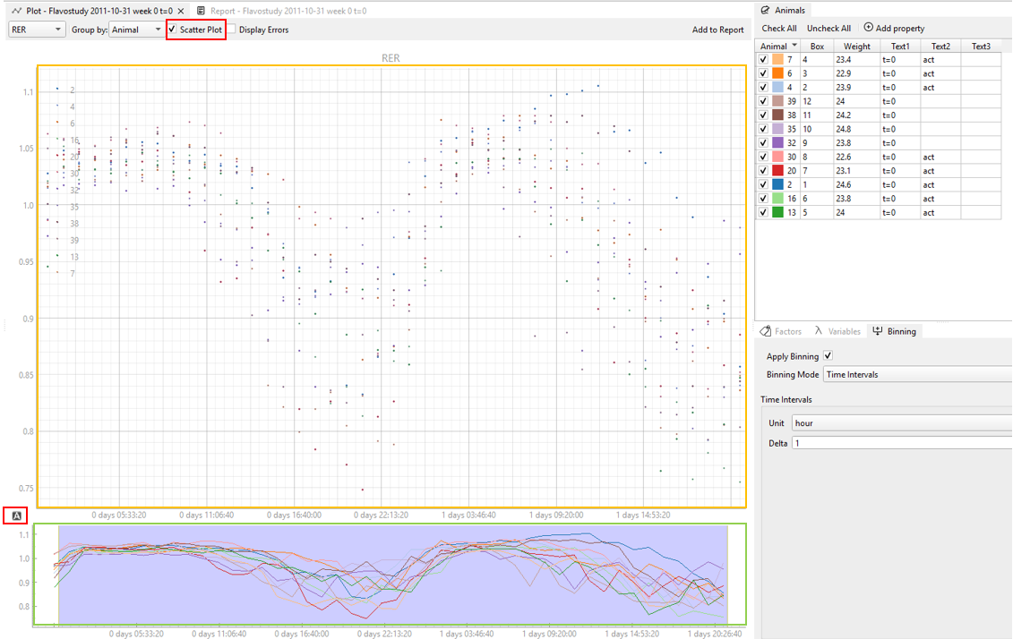
Binning Mode: The binning mode for plot display can be further adjusted using the Binning → Apply Binning panel at the bottom-right of the interface.
-
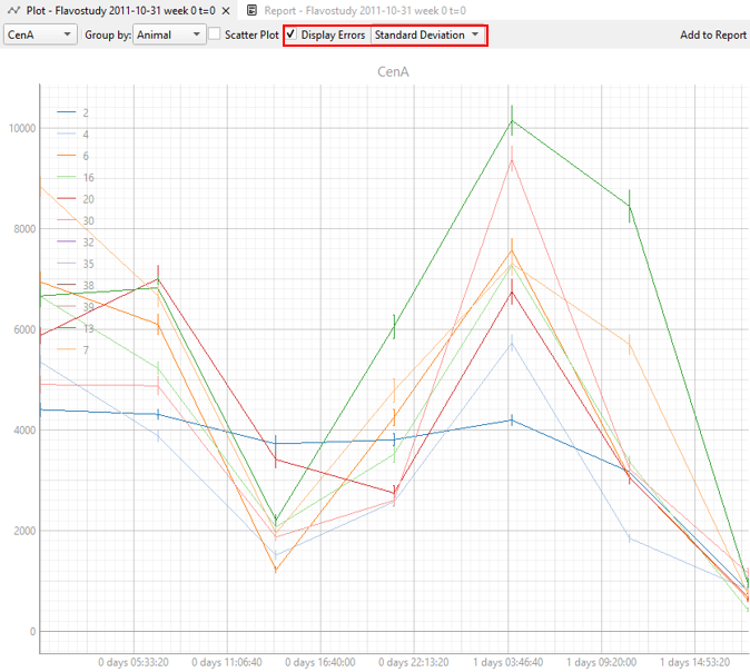
Display Errors: Error bars can represent either the variability of the data (Standard Deviation, SD) or the precision of the mean estimate (Standard Error, SE). Selecting Display Errors will show error bars on the plot, with the type configurable as Standard Deviation or Standard Error. When grouping by factors (Group by factors), error bars will not be displayed if a factor group contains only a single animal or if only one animal is selected.
For line and scatter plots (only if no time binning is applied or time binning using time intervals is applied): - To change the plot style from line to scatter plot, the Scatter plot tick box must be checked. - For line and scatter plots, two data plots are displayed. The large upper window is the main plot window and all settings specified in the control panel will be applied to this plot. The smaller plot at the bottom is always displayed as a line plot without error bars and serves as an overview over the whole plot. When the upper plot is used for zooming or enlarging an area of interest, a blue rectangle in the smaller plot at the bottom indicates the sector of the whole plot that is currently displayed in the upper window. - The layout of both plots can be reset to their initial state by clicking “A” in the bottom left corner of each plot. The reset button (“A”) is only visible when hovering over the respective plot with the mouse cursor.
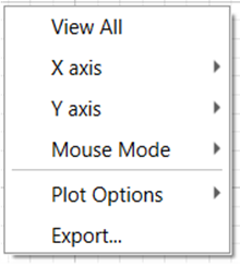
Right-clicking on the plot opens a submenu for plot modifications. Here, further adjustments regarding the plot appearance (e.g. axis, grid, transparency, etc.) can be made.****
Note
All changes made through the control panel are reflected automatically in the plot. For large datasets, there may be a short delay of a few seconds.
The current plot can be added to the report by clicking Add to Report in the control panel and will be saved together with the currently active workspace or can be used later for export.